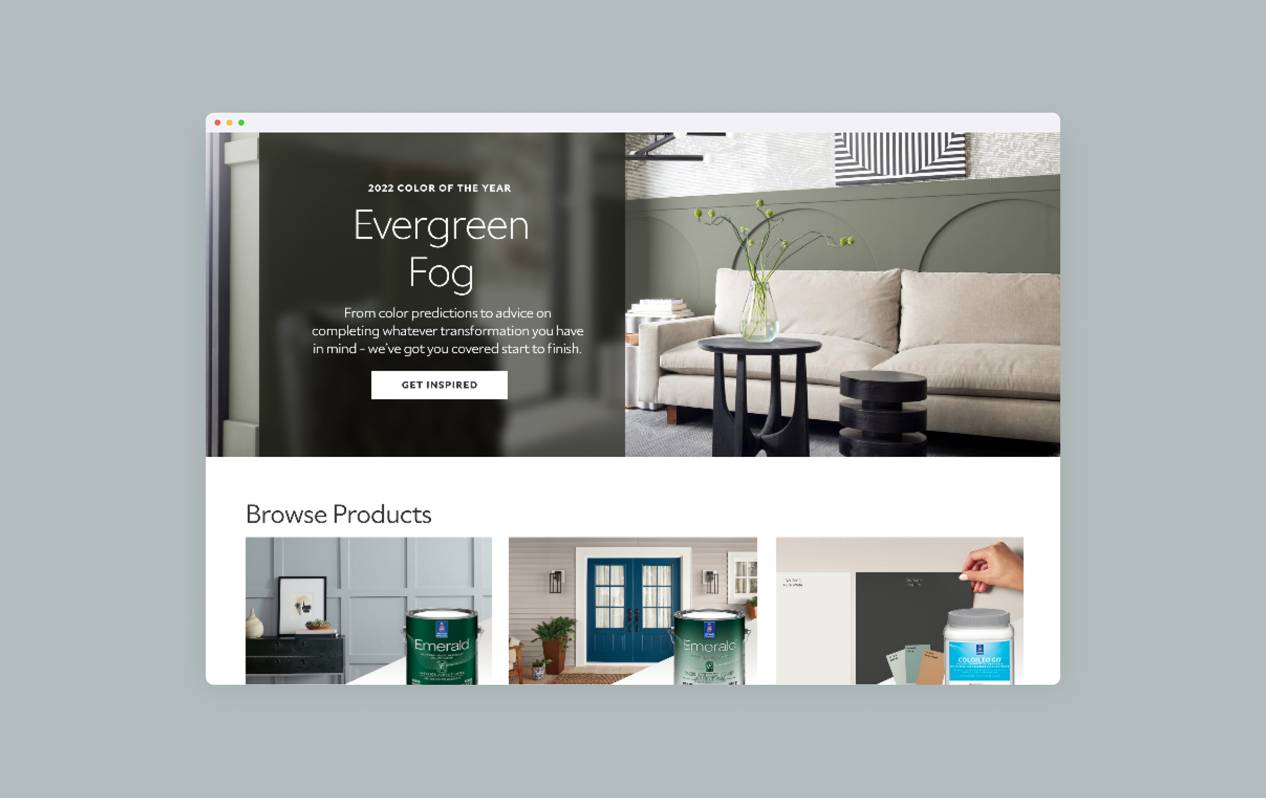
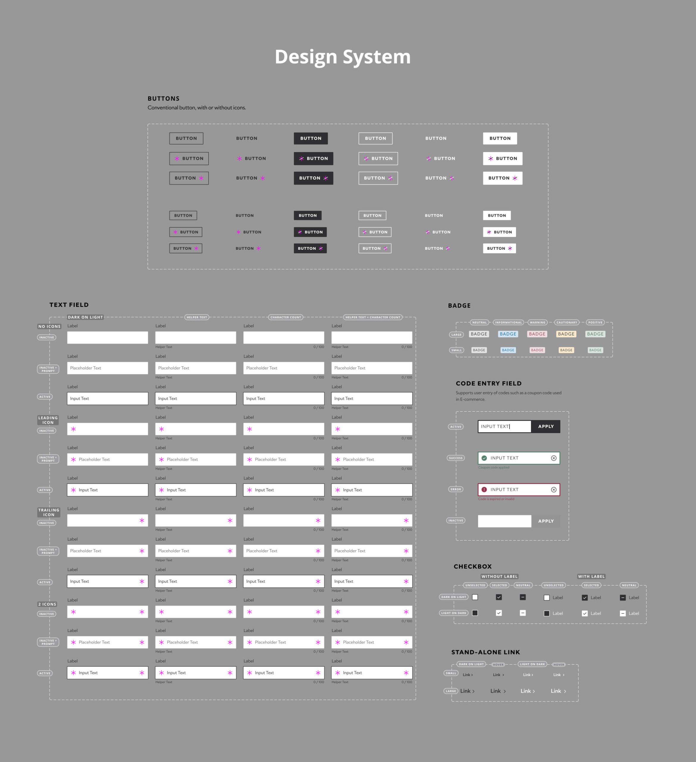
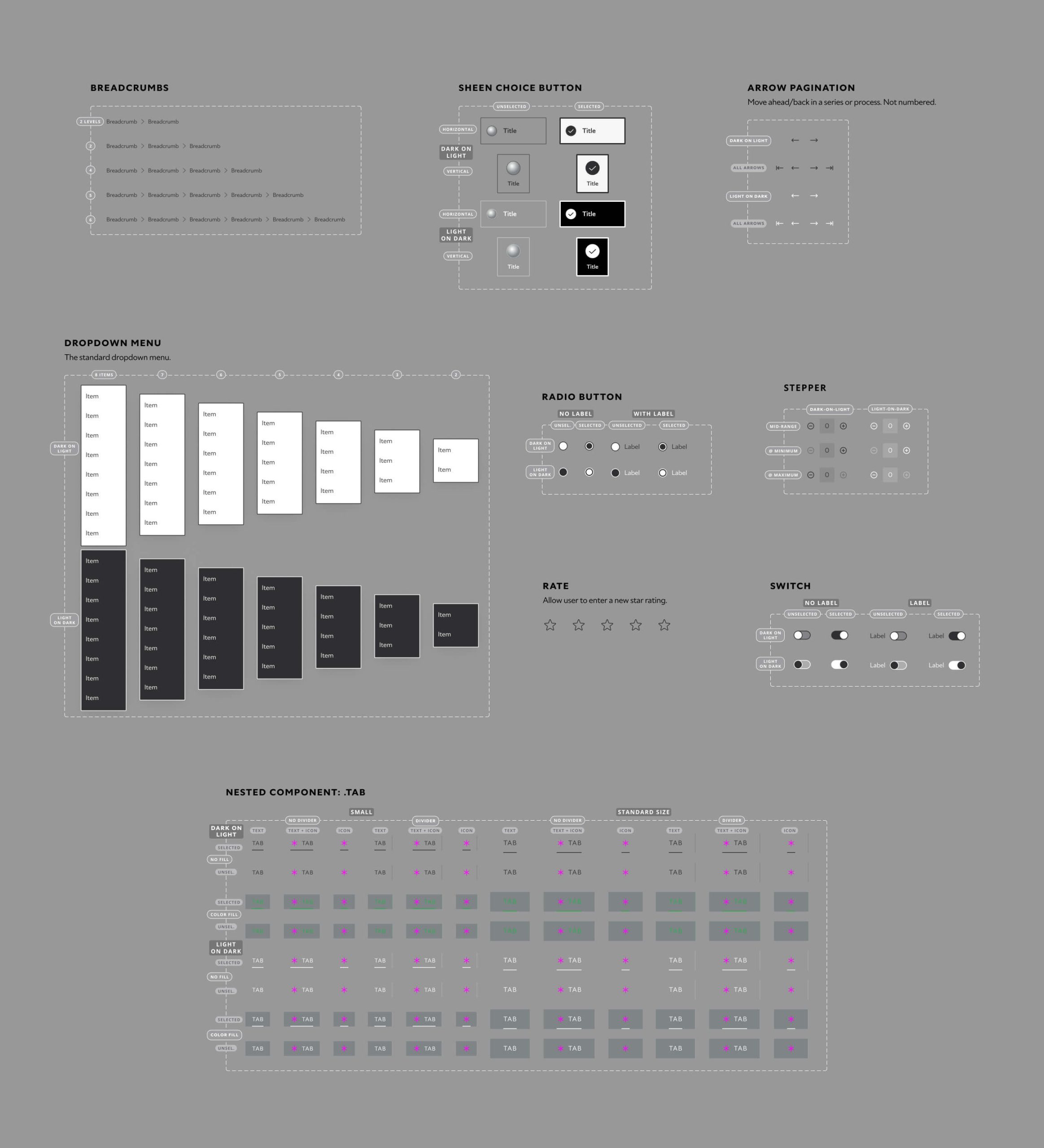
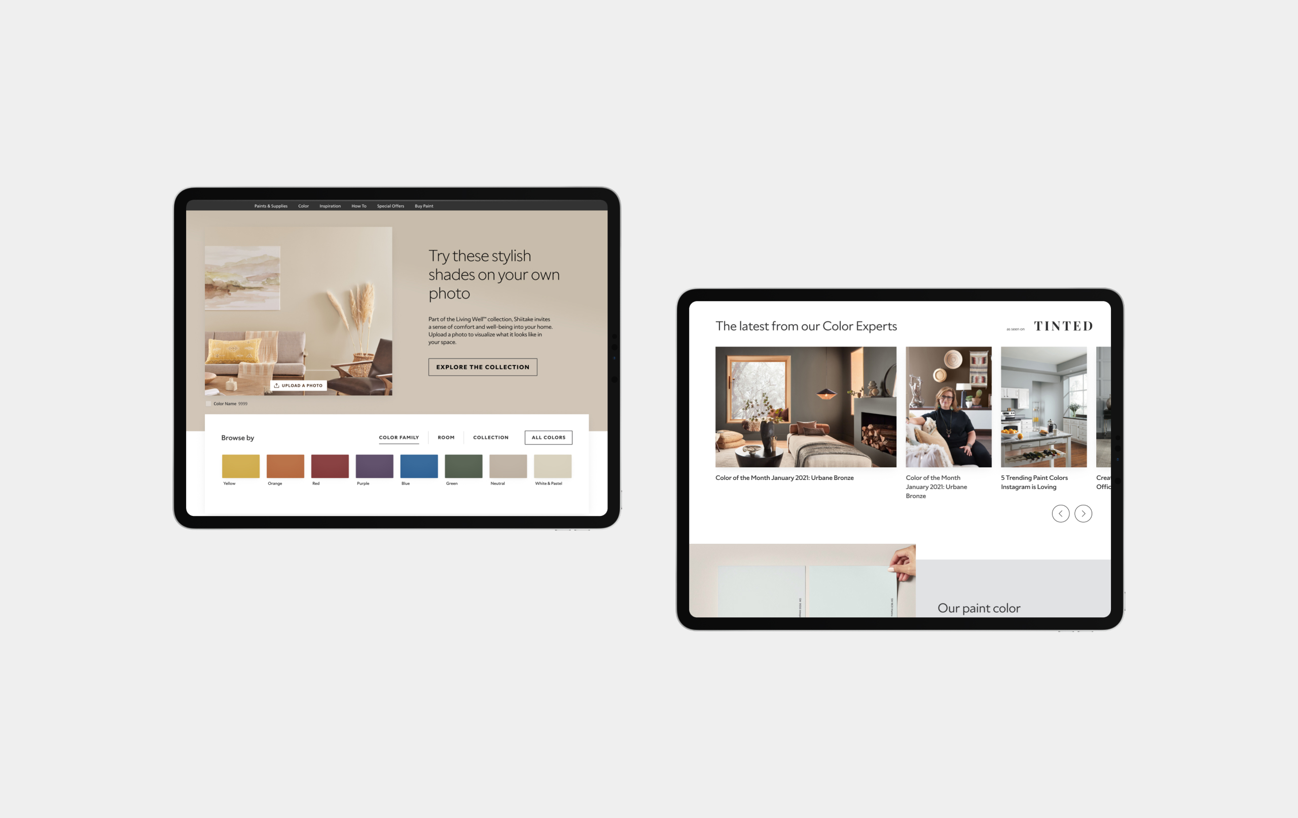
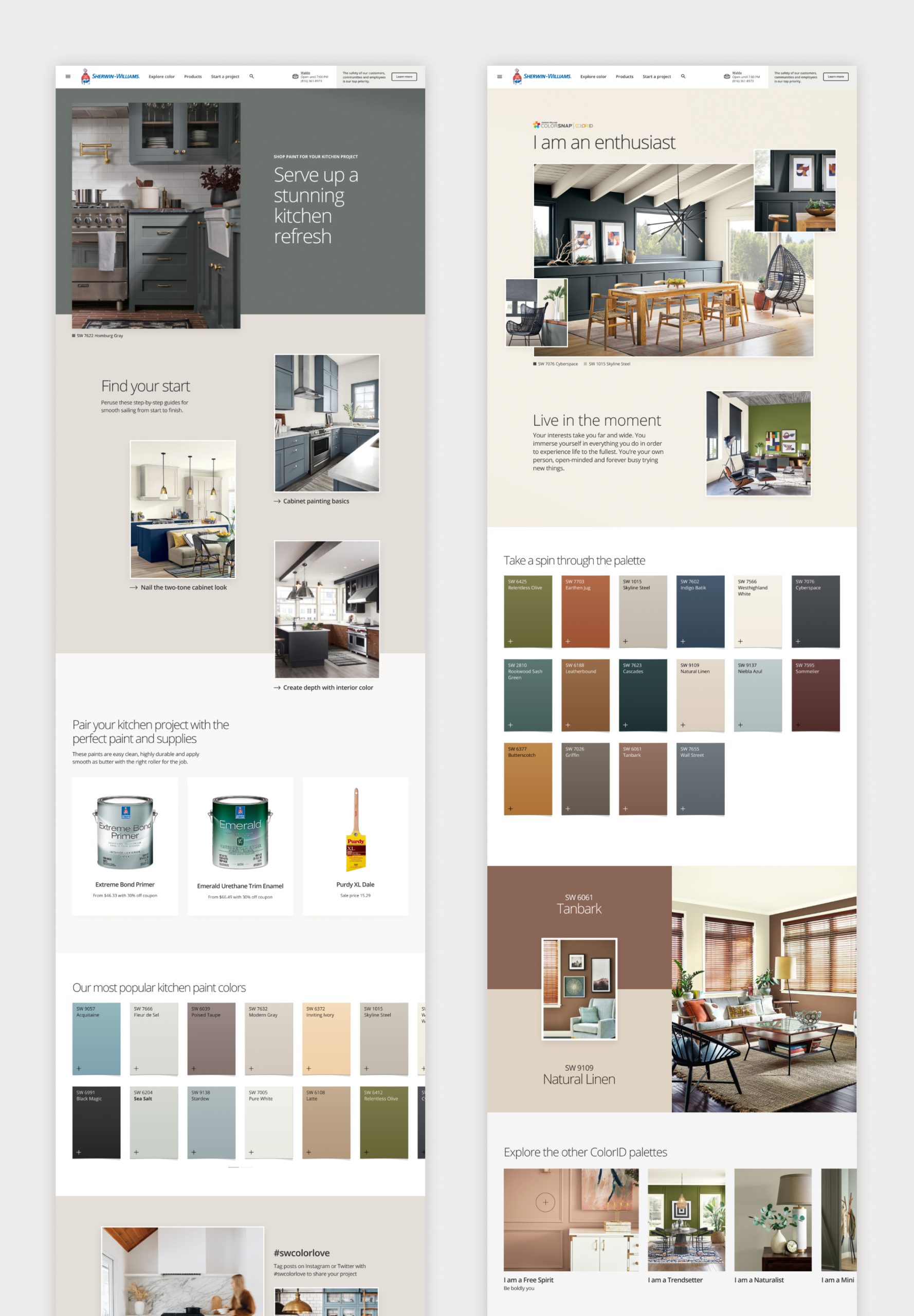
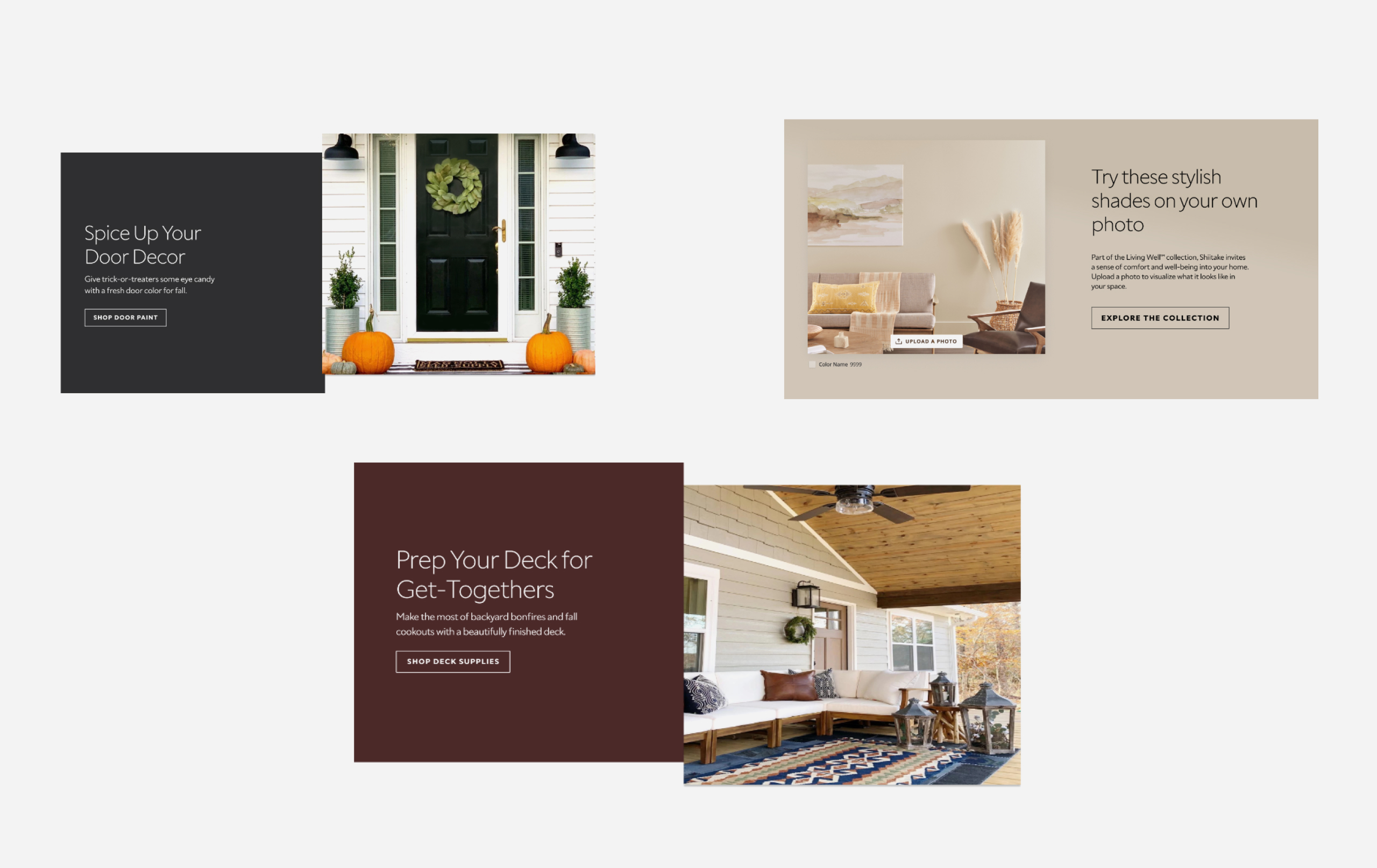
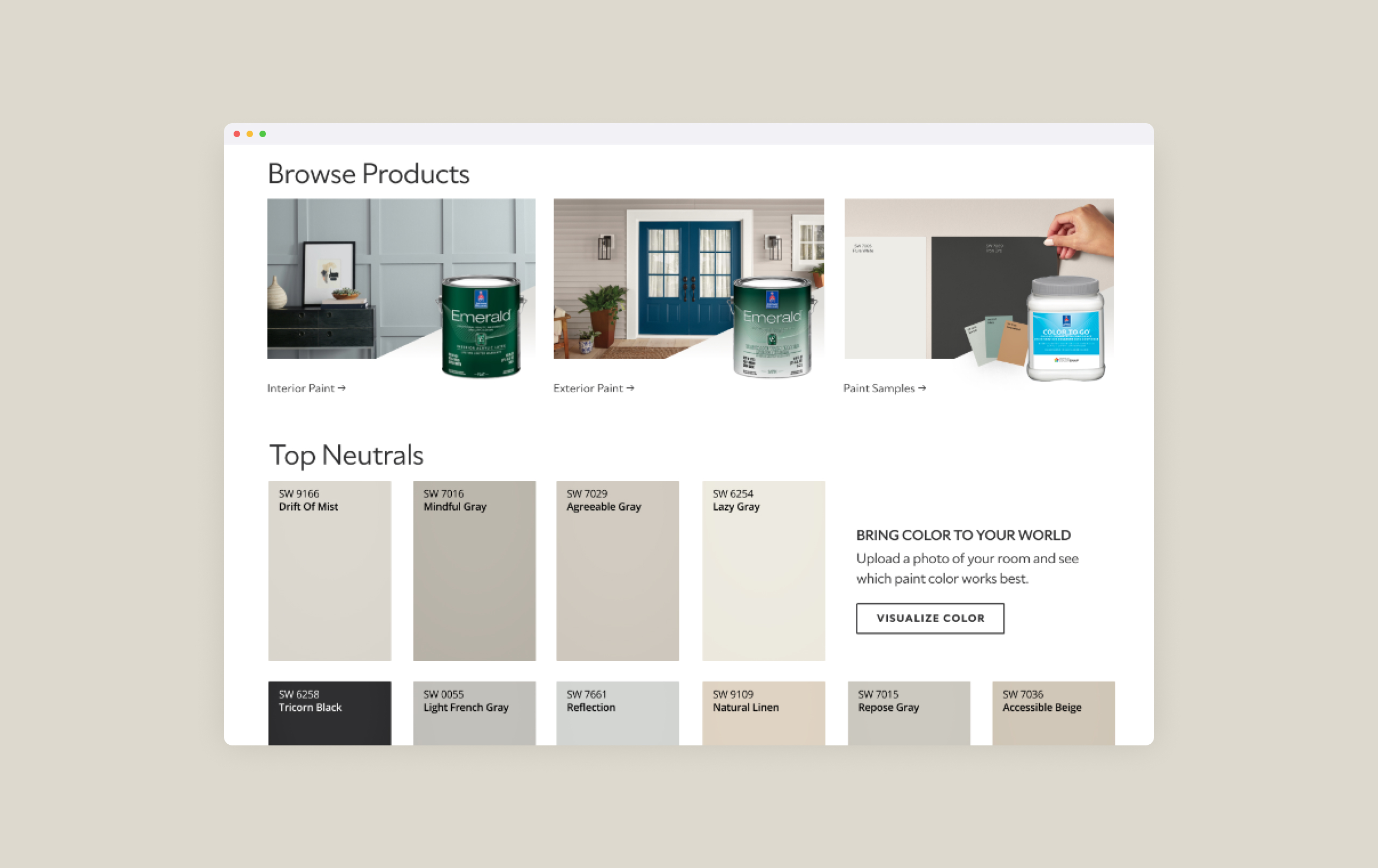
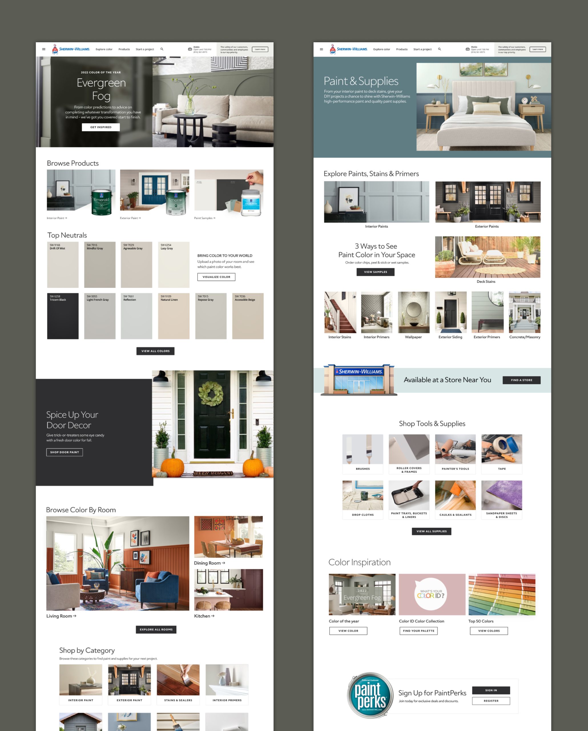
I focused on arranging things so it’s simple to find what you need. I used colors and designs that match Sherwin Williams’ style. The new page makes it easy and fun for users to look at different colors and get all the details they need. Information about each color, like its code and where it’s best used, is shown clearly. The result is a page that looks good and is easy to understand. It makes it simple for people to get all the info they need when picking colors for their projects, making the whole experience better for them.
